Typography
Most of the information that is present in a user interface for the purpose of passing information across is represented via typography. Correct typography structure and appropriate application is important in all interfaces.
After a suitable typeface has been chosen, it needs to be arranged to form the various fonts that will be used to address different text needs across designs.
Type Scale Customization
It is not compulsory that all of the sizes in a type scale be used. However, when choosing a size from the scale, ensure to identify possible use cases in proposed designs to ensure efficiency and reduce any chances of having redundant text styles. Remember that less is more and a particular font size can function in multiple capacities. After making a selection of sizes, if there is subsequent need for an additional size because of a recurring use case, then a suitable corresponding size can be chosen from the scale. This is a better practice.
For Layer5, we utilized the major third ratio to generate a type scale that we could work with.
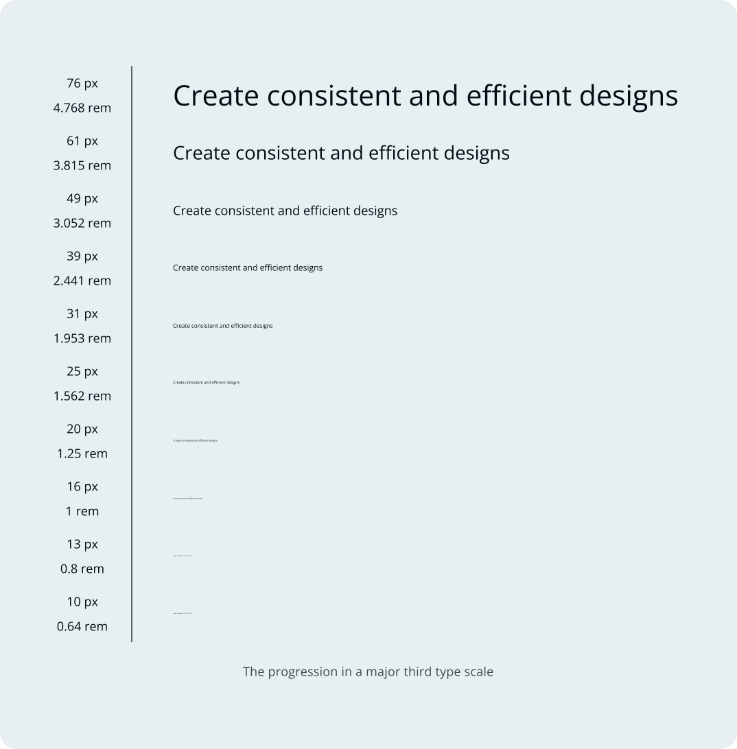
From this type scale, seven text sizes were selected to account for various needs in our websites and products. These sizes were further modified with suitable font specifications that will provide accurate guidance for usage across implementations.
To create even more consistent designs, it is important to consider typography with spacing and spatial proportions in mind. As a rule of thumb, it is advisable that values obtained from the modular scale are rounded off to a multiple of the base space value being used across a set of designs. So for instance, if a set of designs has a base space value of 4px or 6px, then, the font sizes selected are rounded off to be multiples of four or six respectively.
In keeping with this, the values of the above sizes are noticeably distinct from the original type scale that it was derived from. This is because our base space value is 8px and as such, all the text sizes have been rounded off to a multiple of eight. This same principle is applied to the accompanying line heights of these text sizes as well.
Layout Considerations
For any digital product or website being created, one important thing to be considered is the responsive nature of design, which translates to what the said design will look like across different screen sizes (desktop, tablet, and mobile). To this end, it is also crucial that any of the text styles selected account for these different layout sizes as well. As stated earlier, text styles can be used for multiple needs across a given design. The important thing is that there is proper documentation to point this out, ensuring that hierarchy and prominence are duly established.
Establishing Hierarchy
Since the selected text sizes cannot all be used for the same purpose, it is necessary to differentiate them from each other in order to have a working typography system that applies to different use cases and layout sizes. This will require exploration and multiple tests of these text styles in the screen sizes they are intended for and the possible use cases that they will account for which may have already been identified in the early stages before use.
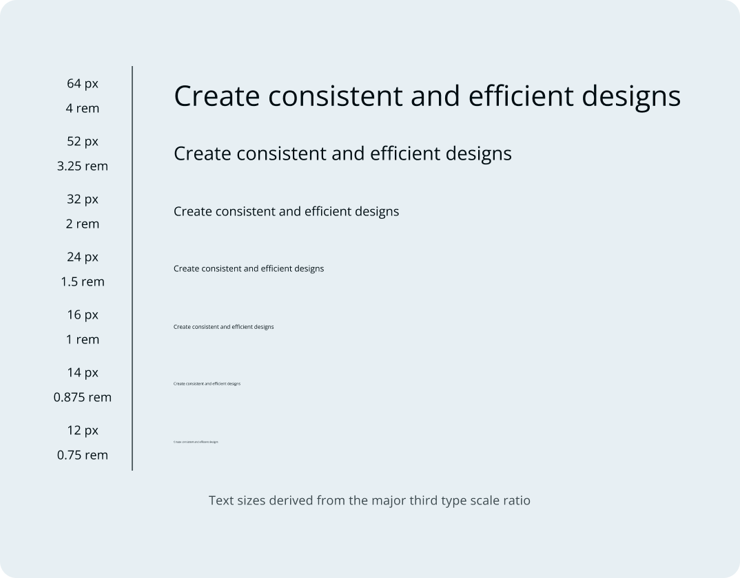
With these seven different text sizes derived from the type scale, we have come up with 13 fonts that can be applied in multiple use cases and across multiple devices. This variation ensures that fonts are not created randomly and utilized based on individual discretion, eventually leading to multiple redundant fonts present in our type system. These fonts must be considered first for application in any use case. If the need arises for a new font to be added to the type system, sufficient use cases have to be established to do so.
NOTE:
A new font can be something as little as changing only the font weight of an already existing font and having both variations function in different capacities. Of course it can also include replacing an already existing font or creating an entirely new one to add to the type system.
Font Specification
Each font should not be a product of random choices just to have a set of text to work with. They should be informed decisions based on how they can assist to reinforce a brand, what they can be used to achieve in designs, and to what extent they should be applied. For more documentation, check out details on each font in the Code section for `Typography`.
Heading
Headings are usually the first thing a user sees when reading a block of text. The idea is for them to be concise and provide a hint of what readers can expect from the accompanying body of text or an entire page. It should also capture attention and encourage further exploration. They can range from large hero section headings to much smaller subtitle and label headings. Whatever the case, headings at different sizes can help to accurately indicate hierarchy and provide guidance for any reader going through a group of text.
Of Layer5’s ten fonts, seven of them can function as heading text and ensure hierarchy for different context. For text that needs to be prominent in a group of text (especially at the beginning), any one of these fonts will suffice.
Body
A bulk of text content is written in body or paragraph fonts. These are less prominent (larger) fonts that provide more context to what brief ideas any available headings may have outlined. It can also be used for short text in components and when creating other interface elements due to its higher legibility when compared to heading or subtitle texts. Three font sizes have been earmarked to function in this capacity for the text needs in Layer5 and across all of its products.
Label
To highlight supplementary information for interface elements, label texts can suffice. They provide extra information for users as they navigate a solution. Label texts ideally do not need to be too prominent hence their smaller size compared to the body text category. There are two label texts available in the Sistent type system.
Code
This fonts are curated specifically for the purpose of writing code across our websites and solutions. They can be used to highlight code related text in designs like token values, code snippets for components and any other code related application. Two fonts have been made available for this purpose.


