Typography
Most of the information that is present in a user interface for the purpose of passing information across is represented via typography. Correct typography structure and appropriate application is important in all interfaces.
There are a couple of things to consider when preparing to apply typography to any interface.
The Basics
Typeface
A typeface is a set of letters, numbers, and accessories that have common design features. These characters are usually grouped into families and used in relation to each other to ensure uniform text representation in designs and forms of text that are relative to each other. Qanelas Soft, Times New Roman, Merriweather, and Roboto are all examples of typefaces.
Font
Often wrongly used interchangeably with typeface, a font refers to variations of a typeface. So this includes the weight, size, line height, tracking (letter spacing), and any other features that are added to a typeface for it to function in a certain capacity. A key relationship between a typeface and a font is that characters in a typeface can be modified to form different fonts.
Line Height
Line height is mostly used to refer to the distance between lines of text. WCAG standards for line height recommend a line height that is at least 1.5 times the chosen font size, especially for small text sizes. For larger fonts, however, evidence has shown that anything between 1.2 and 1.5 times the font size might also be appropriate, especially considering the fact that most large fonts used for headings and subheadings tend not to exceed a single line of text.
Type Scale
Type scale with respect to typography points to the set of incremental steps or rations that dictate how font sizes increase or decrease as you move up or down a given hierarchy. This increase or decrease is usually originated from a base size that serves as the defining font within the scale. These steps create a systemic progression of font sizes that maintain harmony and visual balance within a system because of the relationship they share with the base font.
The base size used to generate a type scale is determined by the principles governing size, typography, and other brand specific contexts. As a design best practice, a text size of 16px is generally accepted as very legible for responsive design. It is also a multiple of eight which is our base space value and this is further elaborated on in Spacing. Reasons like these influence its use as a base size for our type scale. A modular type scale can be generated using harmonious values like the golden ratio, the major third, the perfect fifth, and so on.
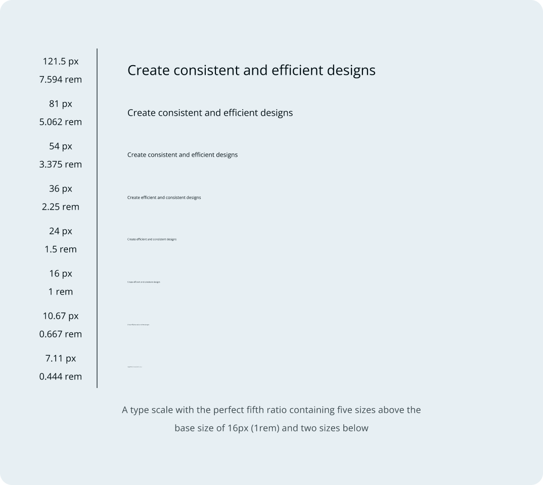
Because of the progressive increase or decrease that governs the content of a type scale, it makes it easier to obtain consistent, related, and harmonious font sizes that can each be used for specific needs when curating digital interfaces.
Font Pairing
Sometimes, it might be necessary to make use of more than one typeface. In such a case, an applicable principle is that one of the typefaces is used mostly for headings and subheadings, while the other is used for most paragraphs and body text needs across the same design. Detailed research on typefaces and their compatibility will help to make informed decisions when it comes to choosing a typeface for font pairing.
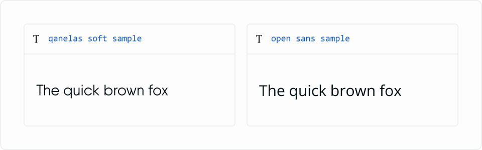
Layer5 has successfully been able to implement a font pairing of Qanelas Soft for all heading and subheading text and Open Sans for all body, paragraph, and content text needs.