Color
Colors when accurately applied can be a potent tool that enables designers and developers to implement solutions with speed and efficiency. Here are a couple of things to keep in mind.
In order to achieve the aim of maintaining a consistent and engaging digital interface across Layer5, whether it is in the form of websites, applications, or experiences, a detailed explanation of color application along with practical use cases is needed. To this end, the following concepts help to shape a suitable identity as we aim for balance throughout our User Interface.
Introduction
When the color palette is accurately put to use, it ensures a recognizable consistency in Layer5's array of digital interfaces and products. This is made possible due to adherence to well defined rules which though specific, are also flexible and give ample room for professionals to curate appealing solutions across themes.
The Basics
Let's start with a few of the common terms that we will come across frequently, as understanding what they mean will inform us of applicable use cases and proper procedures that should not be overlooked.
Theme
By definition, a theme is a cohesive and consistent look and feel for a product. This consistent look can be achieved with the use of harmonious color palettes, legible fonts and layout patterns. Currently, sistent outlines specifications for light and dark themes.
Value
A value is the unique visual attribute assigned to a token through the use of themes. This could range from hex codes to rgba values which are used to highlight specific colors in any given instance. We highly recommend that no exact values be referenced anywhere in the design in order to avoid errors and ensure consistency. Instead, tokens should be used to curate and implement the reusable values. More on tokens next.
Tokens
Tokens can be regarded as a shared language between design and development for communicating detailed information about how to build user interfaces. Generally, a rule of thumb is to represent the context (background, text, component), role (success, warning, brand, inverse), and modifier(s) (secondary, tertiary, hover) in a string of text that will represent set values gotten from the colors in the color palette.
Role
Roles are parameters that specify the context that colors are being applied to and while different roles can share the same value, the token structure means that they will have different use cases. These values can be different though depending on the current theme.
Color Anatomy
Sistent's default themes are derived from Layer5's color palette of which the Keppel Green color serves as the dominant primary action color with subtle shifts in value to enable the required visual accessibility as recommended in the WCAG (Web Content Accessibility Guidelines) 2.1 compliance standards. It is also sometimes combined with Saffron Yellow and Caribbean Green colors accentuate some other parts of the user interface like CTA buttons as well as illustrations and icons.
The Charcoal color as well as another accent grey serve as neutrals to complement these greens and create harmonious implementations. These five colors combine to form a foundation for the color system.
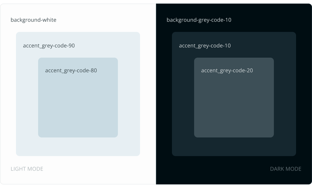
Layer Hierarchy
For backgrounds and surfaces, colors in the neutral palettes are used cohesively to create depth and spatial associations. This hierarchical pattern defines the logic of how colors stack on top of each other in a UI when implementing Sistent themes. This logical pattern goes beyond just themes but is also built across components and accounted for in suggested color tokens as well.
There is an alternate relationship between the layer hierarchy in both light and dark themes:
- In the light theme, as layers are stacked towards the topmost surface, they become progressively darker.
- In the dark theme, as layers are stacked towards the topmost surface, they become progressively lighter.
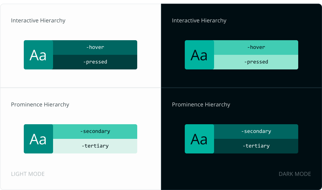
A similar hierarchy pattern as above is adopted for brilliantly colored backgrounds like brand and alert colors when it comes to interactive states. So as interactions progress from default to hover to pressed, this same principle may apply. However, when trying to establish prominence for other user interface needs, an inverse relationship may be more suitable. Hence, for these brilliant colors:
- In the light theme, as prominence reduces, layers become progressively lighter.
- In the dark theme, as prominence reduces, layers become progressively darker.
Green Color Accessbility
In the use of green, Sistent design system ensures compliance with WCAG 2.1 standards for distinguishable text and color. (See criteria 1.4.1 and 1.4.3) Accessibility is a major consideration for Sistent, and as such, accessibility research and guidelines are kept at the core of the color selection process.There is further specification on how to maintain compliance with these standards in both light and dark themes:
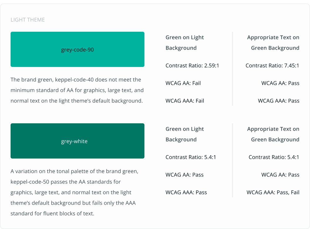
Light Theme
In order to ensure the minimum contrast of the Keppel Green in the the light theme, a variation of it is used in the light theme to ensure proper contrast.
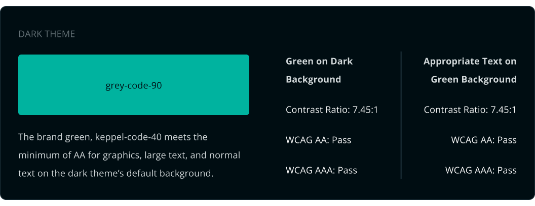
Dark Theme
For the dark theme, the Keppel Green meets the contrast requirement easily and as such can be used as the primary accent color for all necessary use cases.
NOTE:
Take note that if the primary accent color in use meets accessibility standards for both intended backgrounds in the light and dark themes, there might be no need to have a variation of its hue represent it, as is evident in the example above.


