Spacing
Space is the unseen component in designed solutions that enables clear, concise, and consistent arrangement of interface elements across a screen.
Spacing is a foundational consideration in any design endeavor. From intra component spacing to space between elements in a given layout, intentional application of spacing across a digital experience elevates its usability, improves its (or the) experience, and eventually generates much needed website traffic which is a primary goal for most digital solutions.
The Basics
A few concepts can be handy to keep in mind as we consider spacing and its application throughout designs to ensure clarity and proper understanding.
Inset
Inset describes the value of padding for any container in the interface. The description of a container can range from full page layouts, to page sections, all the way down to card containers and even icon frames. Inset accounts for the values of both horizontal and vertical padding. The horizontal and vertical paddings don’t need to have the same value, however, it is recommended that the values for the horizontal padding are equivalent. This principle applies to the values for the vertical paddings as well.
Stack
Stack in spacing is used to describe the space between vertically arranged content in a digital interface. Since most digital content is read from top to bottom, It is only right that they are arranged in such a way that accurately conveys hierarchy, relationship and spatial harmony.
Inline
This is the horizontal space consideration given to elements that are being arranged in an interface. It can be the space between text input, horizontally stacked elements like buttons and so on.
Scaling
To properly implement spacing, a set of values have to be generated using a scale just like was done in the case of typography. This avails us with a fixed range of values that provide the much needed flexibility required by interfaces to be consistent. This range could be derived from a base spacing value which follows a principle like a linear scale from the base value, multiples of the base value, the golden ratio, or a modular scale.
Most digital screen resolutions are divisible by 16 which is a multiple of eight and so, this makes it a good reason to utilize eight as our base spacing value. Our scale, therefore, has been derived from multiples of eight with a half and quarter step of eight included in the scale to account for much smaller space considerations, for example, icon padding. The half and quarter steps have values of two and four respectively.
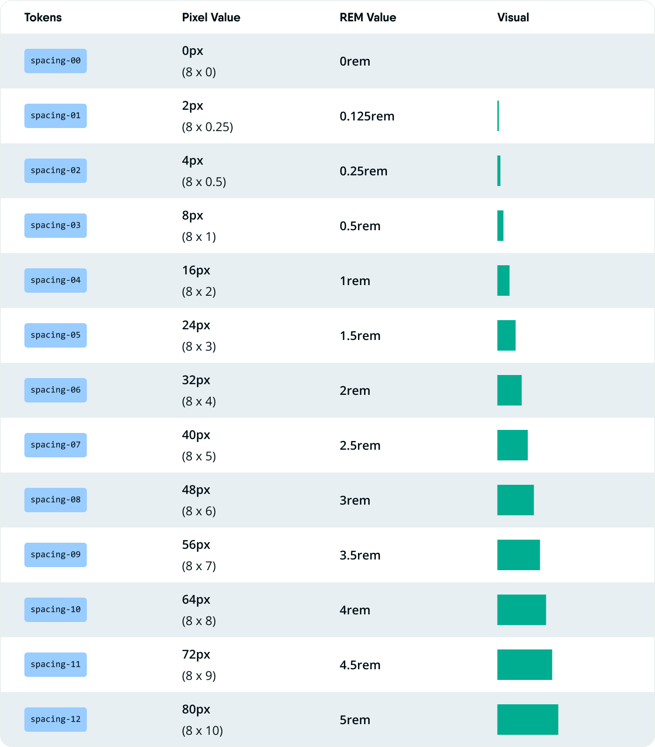
From this scale of multiples of eight, space values for different purposes can now be selected for use in an interface raging from gap between elements on a page to size of elements, to corner radiuses and other space considerations.
Text and Spacing
One factor that should be accounted for when sorting out spacing and other considerations for spatial harmony is text size. Mostly this affects the stack spacing values and their arrangement. Having all text sizes in a multiple of the base spacing value is a principle that can help to avoid inconsistent looking text and space across an interface. This should also be the same for the line height that accompanies these text sizes.
Mostly, the text is arranged in a pattern that takes into consideration the line height of the different sizes of text used in order to represent proper hierarchy and relationships between text content in an interface.


