Spacing
Space is the unseen component in designed solutions that enables clear, concise, and consistent arrangement of interface elements across a screen.
Applying spatial values to designs is a much debated topic and can prove to be quite difficult and very confusing especially when trying to maintain consistency across all designs. To this end, a few concepts have been pieced together in order to simplify the understanding of spatial harmony and ensure a consistent execution.
Spatial Organization
Mostly in an interface, the way space and spatial harmony is achieved is by applying these space values to specific elements or in specific use cases. This can range form the size of a given element to the space between elements on a page.
Gap
Gap can be used to represent the space between any two given elements in an interface. This can be the inset values in a button or a card, stack or inline spacing between blocks of text or a group of elements in a section, and can also be applicable for margin values in a grid system. Because this can be confusing to determine a mode of application given that the spatial system consists of over 10 different values, a set consisting of five to seven values can be chosen to serve as all the values for the 'gap' spacing that will be used in an interface.
Arriving at these values, however is not arbitrary or random selection from the spacing scale. Instead, a geometric progression gotten by multiplying the base space value by a common ratio of two and also dividing by the same ratio will provide the values needed to populate the 'gap' category. This arrangement will ensure uniform space across an interface that will greatly help to establish element relationships and hierarchy.
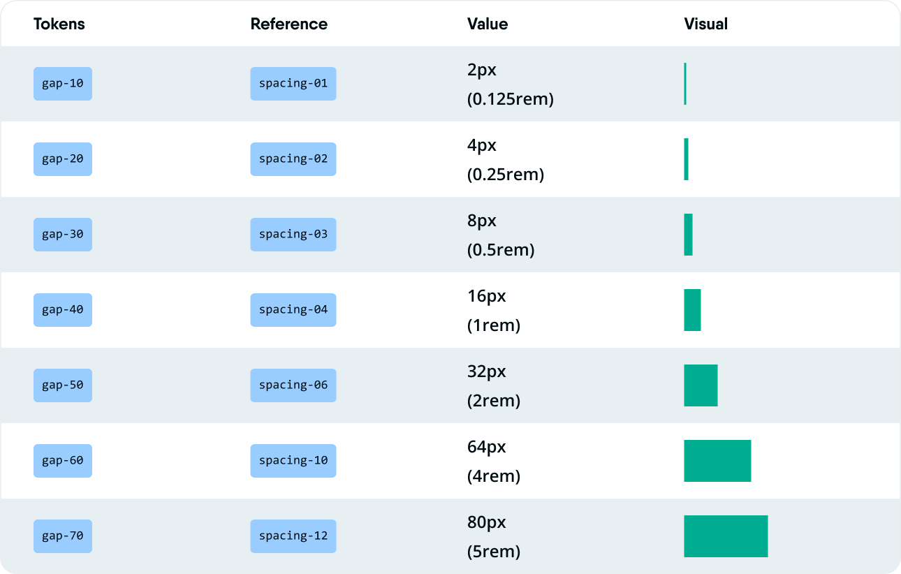
*The last spacing value of 80px that was included was added because 80px is the value for the margin in the 12 column grid that is being applied for desktop screens.
Radius
The radius value of elements in an interface help to define the theme and density that it conveys. Little to no radius can describe a more grotesque or brutal theme, while higher and more consistent use of radiuses can describe a modern and minimal UI theme. Radius values can be determined based on the use case and the needs of the designs being curated. With Layer5, we have chosen five radius values that can provide a the much needed variation that can help to describe a minimal and consistent user interface.
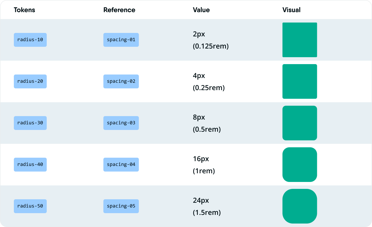
As is the case with most user interface decisions that are agreed upon, these values should be subjected to proper scrutiny based on the intended use case as well as appropriate exploration to ensure the best possible application.
Size
Size refers to the amount of area that an atom or element of a design takes up in the available space of the user interface. Whether it’s that of an icon or the total size of an image, all of that space can be described as size. While it is true that much larger size values may not necessarily be strictly defined in the spatial system, elements which are frequently used and require a fixed size throughout a design can have specific values assigned to them to ensure consistency.
Applicable scenarios can be in the case of buttons, text fields, some cards, navigation menus, logos, and icons. While there are exceptions to these elements, mostly, it is recommended that they appear in a uniform size across an interface to improve the consistency therein.
Space Application Considerations
For spacing to be effectively employed in designs, a few considerations are to be made to enable a simple, yet, uniform application of space values across designs. One such principles is that in a bounding box, the padding of the box should be the highest spacing value. This simply means that for any container, (could be a card, button, an entire page layout) both the horizontal and vertical padding values must be more than any other space values used inside of the container to separate its child elements.
This is applicable whether the horizontal and vertical paddings have the same or different values. To provide more, clarity, the inline spacing in a container should not be more than its horizontal padding, and the stack spacing value should not be more than the container's vertical padding. This gradual decrease in the space value as we go deeper into a container or an element helps to enhance uniformity and consistency across designs.
Exceptions
Of course, these suggestions are not set in stone, and as such, exceptions should be made to accommodate the peculiar needs of a design and its existing principles. One of the cases where exceptions can apply is when proper separation needs to be established among a group of elements.
Although most pages will have a horizontal padding value, they seldom have a vertical padding value and since elements are mostly arranged in a vertical stack in a digital interface, it becomes necessary that proper separation is established in order to assist users to easily identify sections and navigate through the content of a page in the proper manner for better understanding. Varying values of space can therefore be employed in this vertical stack to improve users' clarity and minimize any confusion encountered.


