Color
Colors when accurately applied can be a potent tool that enables designers and developers to implement solutions with speed and efficiency. Here are a couple of things to keep in mind.
Having a color palette is one thing, and organizing it into usable content for cross-functional teams is another. Suffice to say that without proper structure, a good tonal palette can still be unproductive if the target audience have no clue what to do with it. We have organized color into a consumable form to ensure efficient and accurate application in order to achieve desired results.
Tonal Palettes
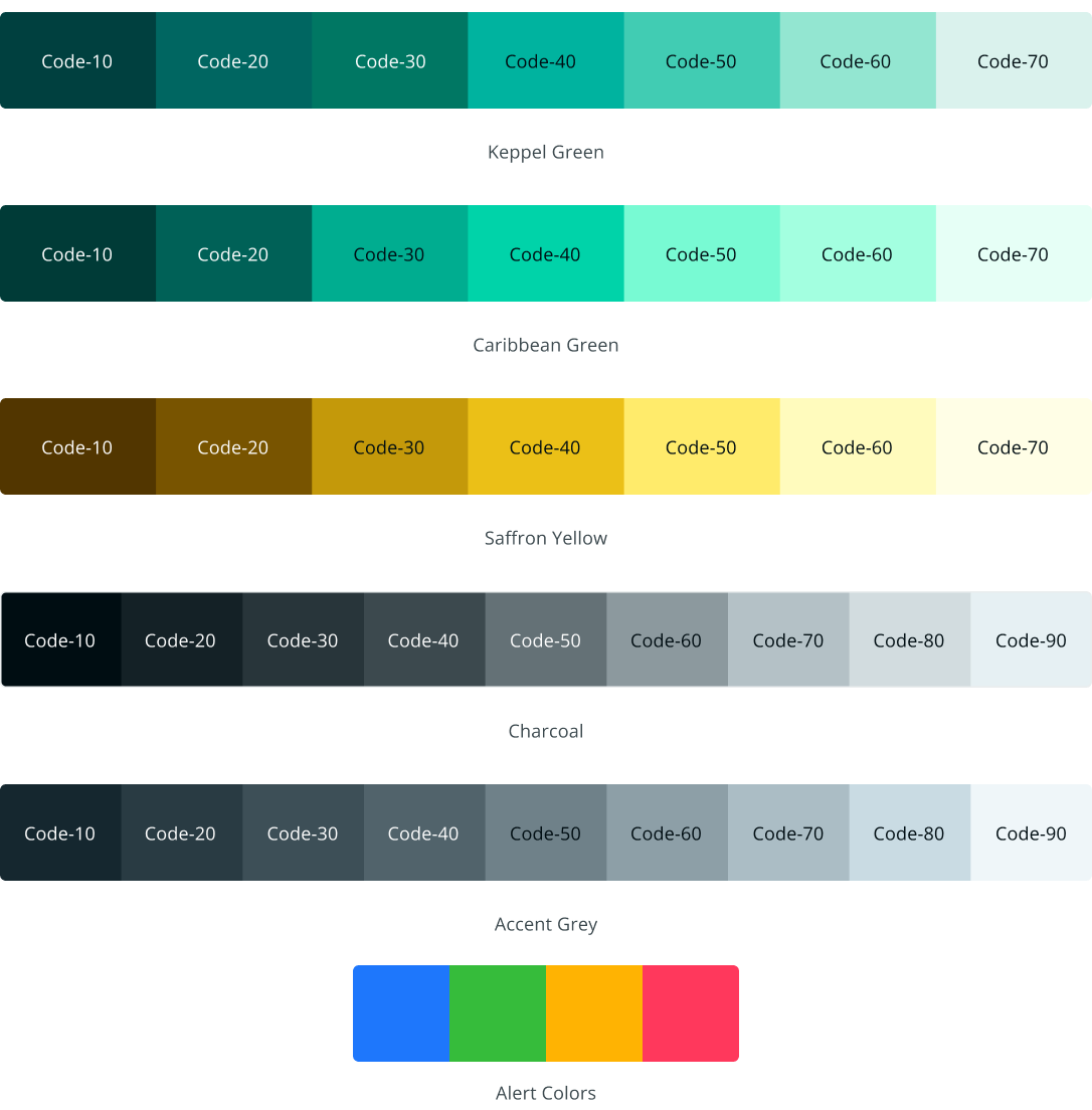
To attain the desired level of variation across themes, we will have to utilize more than just the hues on a brand’s color palette. It therefore becomes necessary to employ the use of tonal pallets. Tonal palettes are variations of a given hue comprising of the hue’s tints and shades. Armed with this array of harmonious colors, it becomes much easier to combine them to actualize different UI elements or states, website pages and various products across any desired number of themes.
These hues are organized into different levels of brightness and arranged in ranges of 10-90 (total of nine) for neutrals and 10-70 (total of seven) for brand colors, as well as all other hues in our color system. This structure will enable cohesive combinations across all implemented designs. With a base hue of ‘code-40’, tints and shades are derived to complete the spectrum range.. These color selections are further supported by alert colors that complement the base Keppel Green. Blue, Green, Yellow, and Red hues were chosen for this.
Basic Colors
We have also structured colors with relatable nomenclature to ensure easy identification and deployment. These names also conveniently double as one of the parameters used in identifying the color group using color tokens. Any one of them must be included in token creation because they specify what it is that is being named making for easier identification.
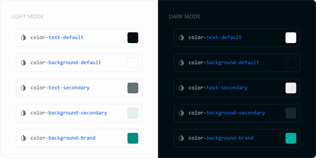
Background Colors
Background colors serve as layer that can house text content, UI elements, and other layers with background colors. It may include but is not limited to specifications like default, hover, pressed, selected, disabled, and brand.
Text Colors
Text color addresses color specifically for the purpose of text that is added as content to the user interface. It is organized into default, secondary, and tertiary sequence. There can also be text color for brand color and other alert colors.
Icon Colors
Icons as the name implies is color used to represent icons throughout designs. Apart form the default and secondary icon colors, they can also be organized with brand color as well as the four alert colors.
Border Colors
Border colors refer mostly to strokes, lines and outlines on an outline button for instance that will need to have specific color to complement designs. They are organized into default, strong, and brand and may also include the alert colors as well.
Token Specification
As highlighted earlier, tokens can serve as a bridge between design and development and, as such, are key in order to ensure a seamless workflow for all interested parties. While these token values can be very specific, like what color to use on the background color of a button, the text color in a given use case, or even a border color, it is also a flexible yet precise and consistent way of carrying out user interface tasks.
Tokenized Colors
To make this work, we cannot rely on individual hex codes for every use case throughout products and interfaces since it will create much less friction going forward.
To this end, we have suggested a set of color tokens that define a color as well as how it may be used, which can also change automatically based on context.
The Role of Color Tokens
While the colors on the tonal palette can be referenced individually, in order for a consistent system to be created, it is crucial that only our top-level color tokens (e.g., text-default) are used instead of base tokens from the palette (e.g., charcoal/code-90) in both code and designs.
Color Schema
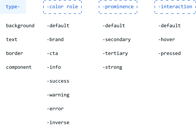
The color schema is a pattern where parameters are stringed together in a particular order. Each of these parameters has predictable names that describe a specific color. Individual parameters combine to form a token system. This is the schema that we have used to arrive at the various parameters:
Type: This is the only required parameter, and it specifies the thing that color is being added to. The basic types we have identified are background, text, icons, and border.
Color Role: Since each color in a user interface has a specific meaning, it is better to represent hues based on how they are used as opposed to a value. For instance, a default accent color can have the parameter -brand. However, this can represent different values of that brand color if there is a shift in tones depending on the theme or for any other related reason.
Prominence: This serves to enhance the visual emphasis of UI elements used in relation to each other. Some of the parameters in the type schema support -secondary and -tertiary prominence parameters, while some other parameters support -default, -strong, and the list could go on.
More categorization can be added to the schema as the need arises. However, it is crucial to ensure that there are sufficient use cases to arrive at this conclusion in order to avoid dormant or idle parameters being created.


